How AI Generates Images from Text: An Illustrated Explainer in the October 2023 Issue of Scientific American

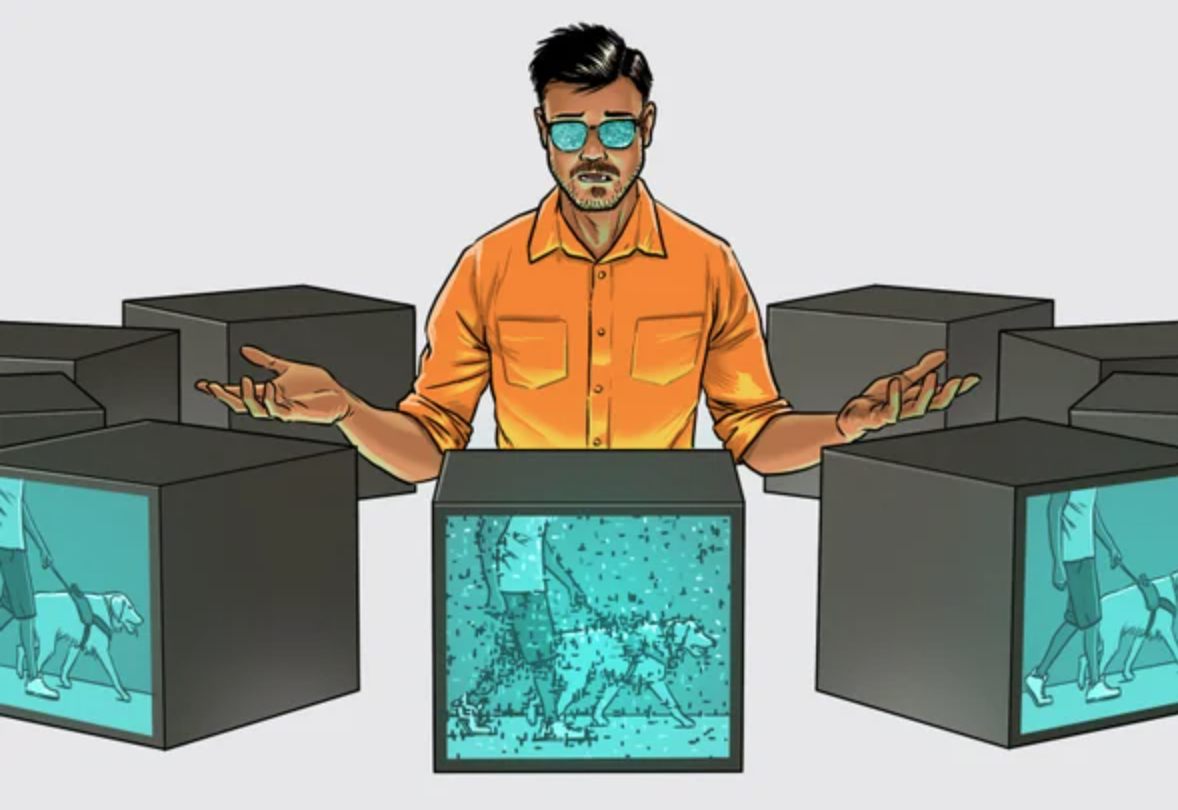
Check out the most recent issue of Scientific American for an illustrated explanation on how AI (Artificial Intelligence) generates images and artwork from text prompts (online version here).

I had a lot of fun learning about the history and development of AI and machine learning while doing research/story development for this piece. It’s fascinating, thought provoking, and maybe even a little scary!

CREDITS:

By Sophie Bushwick, Matthew Twombly, Amanda Hobbs

Illustration (above) by Matthew Twombly

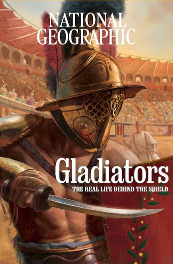
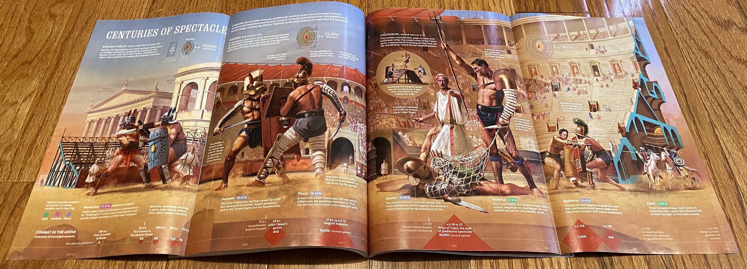
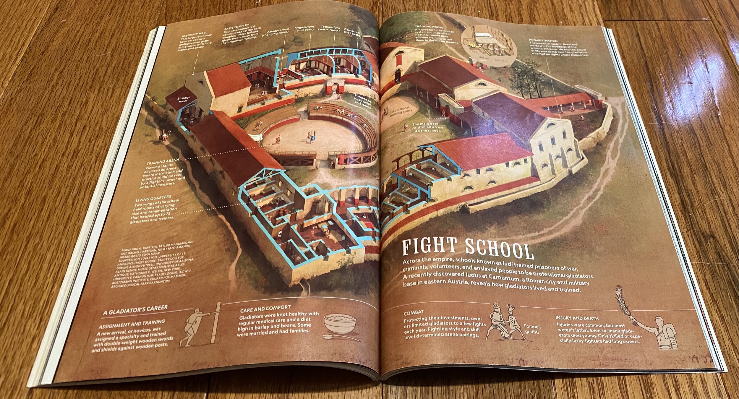
Gladiators: National Geographic August 2021 Cover Story

Ancient Rome is one of my favorite subjects, but this story gave me the unique opportunity to delve into a particular slice of that time period that I hadn’t focused on before: gladiatorial combat. After more than a year of late nights, extensive research, countless drafts, and seemingly endless rounds of revision, these graphics finally went to press. As always, I was (and continue to be!) immensely grateful to be able to work with Fernando Baptista, whose incredible talent, attention to detail, and dedication to getting the illustrations “just right” never fails to impress.

National Geographic magazine, August 2021. Reproduced with permission.

Fernando G. Baptista, Taylor Maggiacomo, and Rachel Hartigan, NGM Staff; Amanda Hobbs; Rocio Espin Piñar.

Sources: Jon Coulston, University of St. Andrews; Hazel Dodge, Trinity College Dublin; Alison Futrell, University of Arizona; Alain Genot, Musée Départemental Arles Antique; Katherine E. Welch, New York University. Carnuntum: Klaus Löcker, Ludwig Boltzmann Institute; Eduard Pollhammer, Archaeological Park Carnuntum.

Click here for the online version.

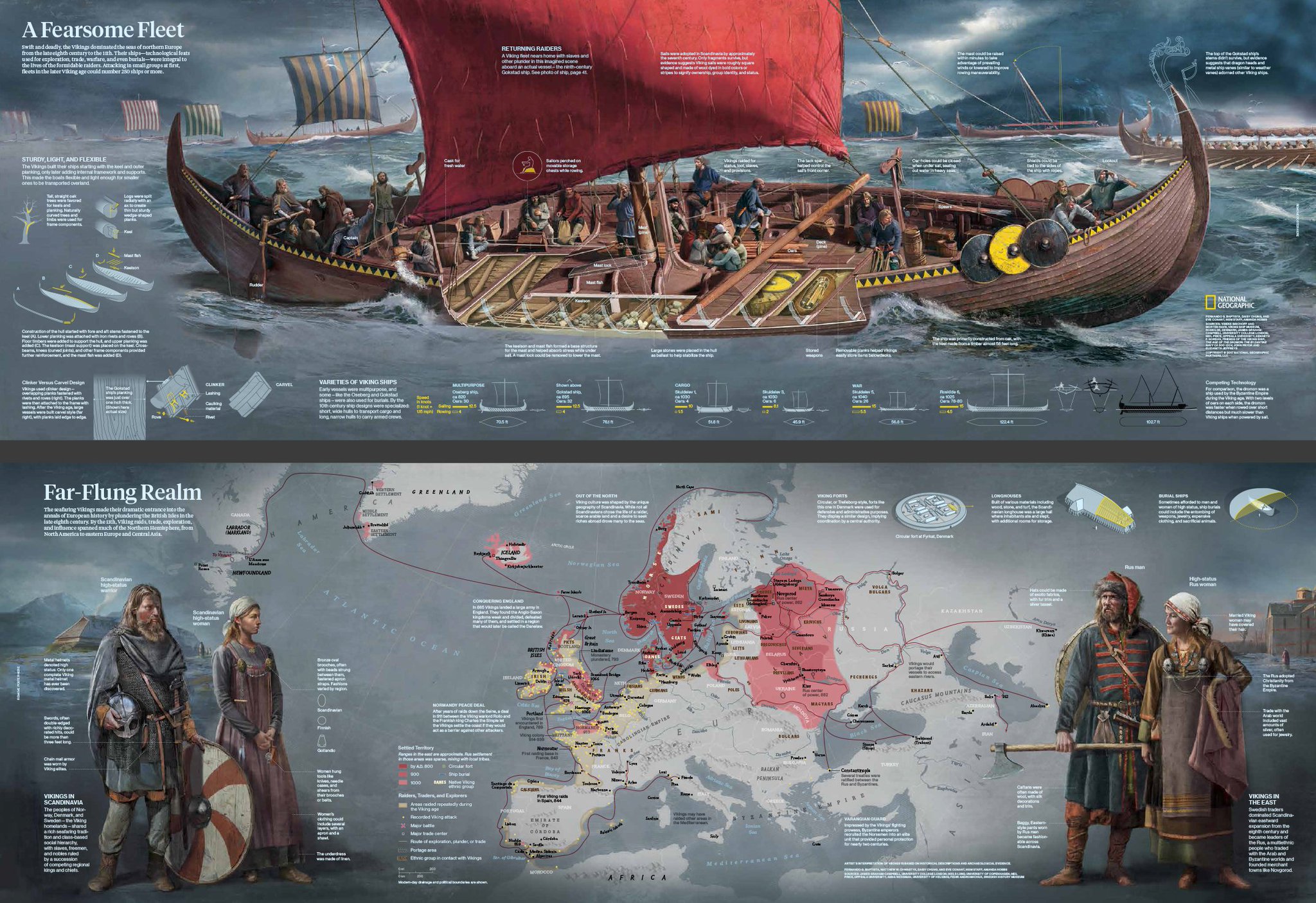
A Fearsome Fleet: Vikings in the March Issue of National Geographic magazine

I recently had the pleasure of working with the amazingly talented Fernando Baptista and Matthew Chwastyk to create a 10 page, double-sided gatefold for National Geographic magazine. It took months of research and consultation with experts (and several trips to the Viking Ship Museum in Roskilde, Denmark--conveniently located less than 2.5 hours away from my home in Sweden) to gather information on every aspect of Viking seafaring and exploration: from shipbuilding and trade routes to weapons and clothing. You can check out the end result in the March 2017 print issue of the magazine (graphics pictured below) and online here:

In addition to the print article, I also helped with the research for a short companion animation—A Fearsome Fleet: Secrets of the Vikings—produced by Hans Weise, Fernando Baptista, and Monica Serrano. Created entirely out of paper, it brings Viking history and myth to life by telling the story of Harold, a young Viking who learns the shipbuilding trade and later sets out on a grand adventure.

CREDITS:

Graphics: Fernando G. Baptista, Daisy Chung, Matthew W. Chwastyk, And Eve Conant, Ngm Staff; Amanda Hobbs. Sources: Vibeke Bischoff And Morten Ravn, Viking Ship Museum, Roskilde, Denmark; James Graham-Campbell, University College London; Neil Price, Uppsala University; Kenneth F. Nordan, Friends Of The Viking Ship; The Age Of The Dromon: The Byzantine Navy Ca 500-1204, John Pryor And Elizabeth Jeffreys; Niels Lund, University Of Copenhagen; Anna Wessman, University Of Helsinki; Fedir Androshchuk, Swedish History Museum.

Animation: Fernando G. Baptista, Hans Weise, Mónica Serrano, Daisy Chung, Alberto Lucas López, Oscar A. Santamariña, Matthew W. Chwastyk, Laruen E. James, Amanda Hobbs, Nils Östergren, Eve Conant, María Begoña Marroquín González. Sources: Vibeke Bischoff And Morten Ravn, Viking Ship Museum, Roskilde, Denmark; James Graham-Campbell, University College London; Neil Price, Uppsala University; Félix De La Iglesia Salgado, Andalusian Historical Heritage Institute.

"National Geographic Infographics": New book available from TASCHEN in January 2017!

Earlier this year, I helped with the research and copy editing for a new book being published by TASCHEN: National Geographic Infographics.

An inspiring anthology of some of the magazine’s best graphics from 1888 to today, the book includes an introductory essay by Nigel Holmes and seven chapters covering a wide range of topics: History, The Planet, Being Human, Animal World, World of Plants, Science & Technology, and Space.

I was incredibly honored to be involved in making this book a reality, and even happier to see so many colleagues, friends, mentors, and predecessors included among its pages. From Ancient Egypt to Space Exploration, the information graphics presented here are prime examples of visual storytelling that engage, inform, and inspire.

Read more about National Geographic Infographics via the TASCHEN website (or this recent write-up in Wired), and order your copy today!

The Data Viz Debate, Hosted by Tableau

ATTENTION Data Viz fans! I'll be moderating an online "Data Debate" featuring Andy Kirk (visualisingdata.com) and Andy Cotgreave (Tableau) on November 25th from 2-3PM GMT (9-10PM EST). Join us as we discuss some of the most pressing issues in the world of data viz - from how to get started in the field to best practices in design!

Find out more and sign up here!

Data4Change Workshop in Beirut, Lebanon

In November of 2015 I traveled to Beirut, Lebanon to participate in a workshop, co-sponsored by Small Media and Visualizing Impact, to help Human Rights Organizations (HROs) learn more about information design and data visualization. As one of the many mentors/presenters, my role was to listen and provide guidance as groups of designers, coders, researchers, and HRO's came together to create interactive visualizations to affect change. The results, which you can read about in an excellent recap on Small Media's website, were amazing.

Thank you to Small Media and Visualizing Impact for hosting the workshop and bringing together such talented and passionate folks from all over the globe. It was an experience I won't soon forget!

Photo by Charbel Saade

Photo by Charbel Saade

Recreating Trajan's Column

When you work in journalism, it goes without saying that you’ll have certain projects that stick with you long after their completion. Sometimes they linger in memory because they’re truly heartbreaking (like the illegal wildlife trade) or unbelievable (like the US daily intake of added sugars). But others, like the recent project I worked on recreating Trajan’s Column, remain fixed in your mind due to the sheer force of will it took to create them.

Over the course of two years, I worked with Fernando Baptista, Daniela Santamarina, and a team of incredible individuals at National Geographic (see full credits below) to research, develop, and refine the graphics for a feature story in the April 2015 issue of the magazine: “Trajan’s Amazing Column.” The end result was a 5 page double-sided gatefold (image below), an interactive digital model of the column, and two videos – one explaining how the column may have been built, and another providing a behind the scenes look at how the first video’s stop-motion animation was produced

A big thank you to all who worked on the project, but especially to Dr. Jon Coulston and Dr. Lynne Lancaster, without whom such a feat wouldn’t have been possible.

CREDITS:

Graphics: Fernando G. Baptista, Daniela Santamarina, and Emily M. Eng, NGM Staff. Samantha Welker; José Miguel Mayo Hernández, Angelica Quintero; Research: Amanda Hobbs. Text: Jeremy Berlin, NGM Staff. Photos: Kenneth Garrett. Design and development: Kevin DiCesare, Joel Fiser, and Jaime Hritsik, NGM Staff. Producer: Amy Bucci, NGM Staff. Sources: Jon Coulston, University of St. Andrews, Scotland; Lynne Lancaster, Ohio University; National History Museum of Romania (plaster cast).

Stop-motion Animated Video: Hans Weise, Fernando G. Baptista, Emily Eng, Megan Roosevelt, Jessica Wang, Daniela Santamarina, Kenneth Garrett, Amanda Hobbs, Lynne Lancaster.

Behind the Scenes Video: David Ehrenberg


Recap: Small Media workshop and VISUALIZEDio

A few weeks ago I had the privilege of attending the Small Media workshop – a 2 day event bringing together designers, researchers, and human rights organizations to learn from each other and create data visualizations to affect change. An amazing experience, it was also an emotional one. In my career, I’ve worked on various kinds of editorial projects - from archaeology, to evolutionary science, to climate change, to space exploration – but rarely focused on politics or foreign affairs. So, when I learned about the Small Media workshop, I knew I needed to apply.  I wanted to challenge myself and delve into a completely different kind of research. And boy . . . did I.

On the first day, after a lengthy walk through of the “best practices” regarding design and research, group assignments were made. Each team consisted of a representative(s) from a human rights organization and a combination of researchers, designers, and developers with numerous different backgrounds (web, marketing, editorial, etc). The goal was to create a data visualization from the data and information provided by each human rights group. And this is where the emotional part comes in. In many cases, the “data” focused on the arrest, abuse, and various other human rights violations against women in certain parts of the Middle East. I won’t go into detail here, but let’s just say that the statistics are both unbelievable and heartbreaking.

Workshop participants listen to one of the group presentations. Photo by Mayra De Ita

Workshop participants listen to one of the group presentations. Photo by Mayra De Ita

By the end of day two, each group presented their proposals for data visualizations, the depth and breadth of which was impressive given the short time frame. For example, one group chose to engage the viewer in an interactive quiz to evoke compassion and empathy, while another allowed visitors to explore and sort data to heighten understanding. Each developed a different approach that best fit the data and message of the human rights organization. The end products weren’t perfect, but they were the beginnings of a roadmap for future projects, the first step in learning how to collect, interpret, design, and communicate sensitive information in a responsible way.

I am very thankful to Small Media, as well as the human rights organizations and designers, developers, and researchers that attended. I feel incredibly humbled to have been counted among such talented and passionate individuals. I certainly hope our paths cross again.

Speaking of talented and passionate people . . .

While in London I also attended VISUALIZEDiO (an independently organized version of the popular VISUALIZED conference) which, to quote their website, explores “the evolution of communication at the intersection of data, storytelling and design.”

The speakers at VISUALIZEDiO 2014 take a bow. Photo by Amanda Hobbs

The speakers at VISUALIZEDiO 2014 take a bow. Photo by Amanda Hobbs

Over the course of a single day, presenters spoke about their work, methods, struggles, successes, aspirations, and inspirations. Sessions were interspersed with generous breaks to encourage people to ask questions and make connections with both the speakers and their fellow attendees. And there was plenty to talk about. Topics ranged from Kate McLean's urban "smellmaps" to Pascal Raabe's lifelogging to Valentina D'Efilippo discussing her new book, The Infographic History of the World. A personal favorite of mine, however, was the presentation given by Domestic Data Streamers co-founders Pau Garcia and Dani Pearson about their incredible interactive data exhibits.

To say that this crowd was energized would be an understatement. Though there was talk of a “data rave” to follow the conference (unofficially, of course), in my mind, the real “data rave” occurred right there at the conference. Between talks, at lunch, and immediately following the last speaker, ideas and contact information were exchanged, points debated, and approaches discussed. People were literally raving over the power of data. And I loved it.

Thank you to the organizers and volunteers - VISUALIZEDiO was an amazing experience, and one I won't soon forget. To the presenters and my fellow attendees - I hope we can work together soon!

To read more about VISUALIZEDiO and see the line up of speakers, click here.


One Perk of Being a Freelancer

If there’s one thing I love about being a freelancer, it’s the ability to test your boundaries, challenge yourself, and do something a little different. So, when National Geographic asked me to try my hand at writing a review for the new NBC comedy show, “Welcome to Sweden,” I thought . . . why not?

Now, you might be wondering what qualifies me (a researcher and visual journalist) to review a television show. Well, if leaving my full time job in 2012 and starting my own freelance business weren’t enough change, earlier this year my husband and I decided to follow his job and move to Sweden. You know, just to round things out. Thus, Nat Geo thought I might have a unique perspective on what the show gets right/wrong. 

The result can be found here. Read, comment, and share as you like – preferably with coffee and a cinnamon bun.  

Amy and Greg Poehler discuss their cross cultural comedy “Welcome to Sweden.” Image courtesy NBC Universal

Amy and Greg Poehler discuss their cross cultural comedy “Welcome to Sweden.” Image courtesy NBC Universal

My answer to the question: "So, what do you do?" (Part 2)

As promised, below you’ll find a selection of projects I’ve worked on over the past few years. Most were done for National Geographic magazine where I worked as the Art Research Editor for almost seven years before starting my own business (and with whom I am currently working on several freelance projects). Some were also mentioned in the presentation I gave last year at Malofiej 21: “Reaching the Impossible, by Researching the Possible.” It goes without saying, but each of these graphics was a team effort. None would have been possible without the incredible resourcefulness, creativity, and collaborative nature of my talented colleagues. For more information on the work of the Art/Maps Department at National Geographic, please visit Juan Velasco’s blog.

__________

When you work in journalism, it helps to have an insatiable curiosity for just about any topic. From space exploration, to the American Civil War, to nuclear reactors, to epigenetics, to Ancient Rome, to the global capital markets . . . you name it, and I’ve probably researched it. And thus, below you’ll find various different kinds of graphics – scientific illustrations, timelines, data visualizations, and historic recreations – each designed according to the particular needs of the subject matter. Instead of just showing you the end product, however, I’d like to walk you through some of the “behind the scenes” aspects of how these particular graphics came together. That is, after all, where I come in . . .

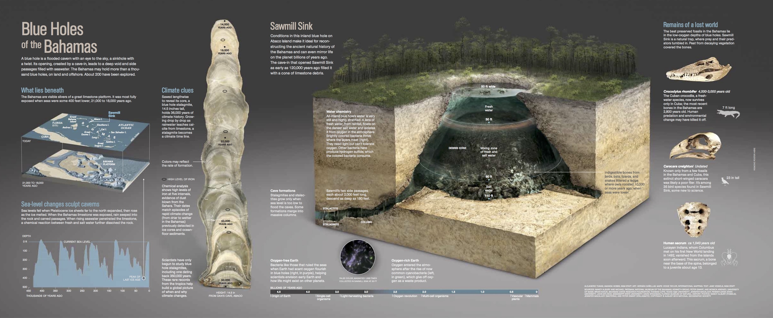
Research is the key to creating any successful journalistic endeavor, and information graphics are no exception – you have to know something about the topic you’re working with before you can start building a graphic. Often, the best way to do this includes talking to experts in the field, searching for data, reading up on the latest scientific papers, and seeing what other media outlets have published on the topic (if applicable). When I worked on a story about the “Blue Holes of the Bahamas,” I interviewed ten different scientists to help explain one particular underwater cave’s environment, history, and significance.  Below is the final version of the graphic published in the August 2010 issue of National Geographic:

National Geographic magazine, August 2010. Reproduced with permission. Alejandro Tumas; Amanda Hobbs, NGM staff. Art: Hernan Canellas. Maps: Vickie Taylor, International Mapping. Text: Jane Vessels, NGM Staff.

National Geographic magazine, August 2010. Reproduced with permission. Alejandro Tumas; Amanda Hobbs, NGM staff. Art: Hernan Canellas. Maps: Vickie Taylor, International Mapping. Text: Jane Vessels, NGM Staff.

In order to produce a graphic like this, I first put together a research packet for the Graphic Editor (Alejandro Tumas) containing interview notes, diagrams, maps, charts, photos, and suggestions for things to focus on:

Bahamas_ResearchPacket.png

The scientific findings I suggested we represent in the graphic were not just fascinating, but incredibly complex, and often interlocking. The research packet allowed us to see the depth and breadth of the subject matter, but also to better estimate how much room we might need to tell the cave’s story. I’m fond of saying that the information you collect is only as good as your method of organizing it, and for this story that definitely proved to be the case. We had so much information, and so many parts of the story to tell, that we had to be as organized as possible to make sense of it all. Only after months of consultation with experts, copious edits, and several rounds of text revisions were we able to create the final version.

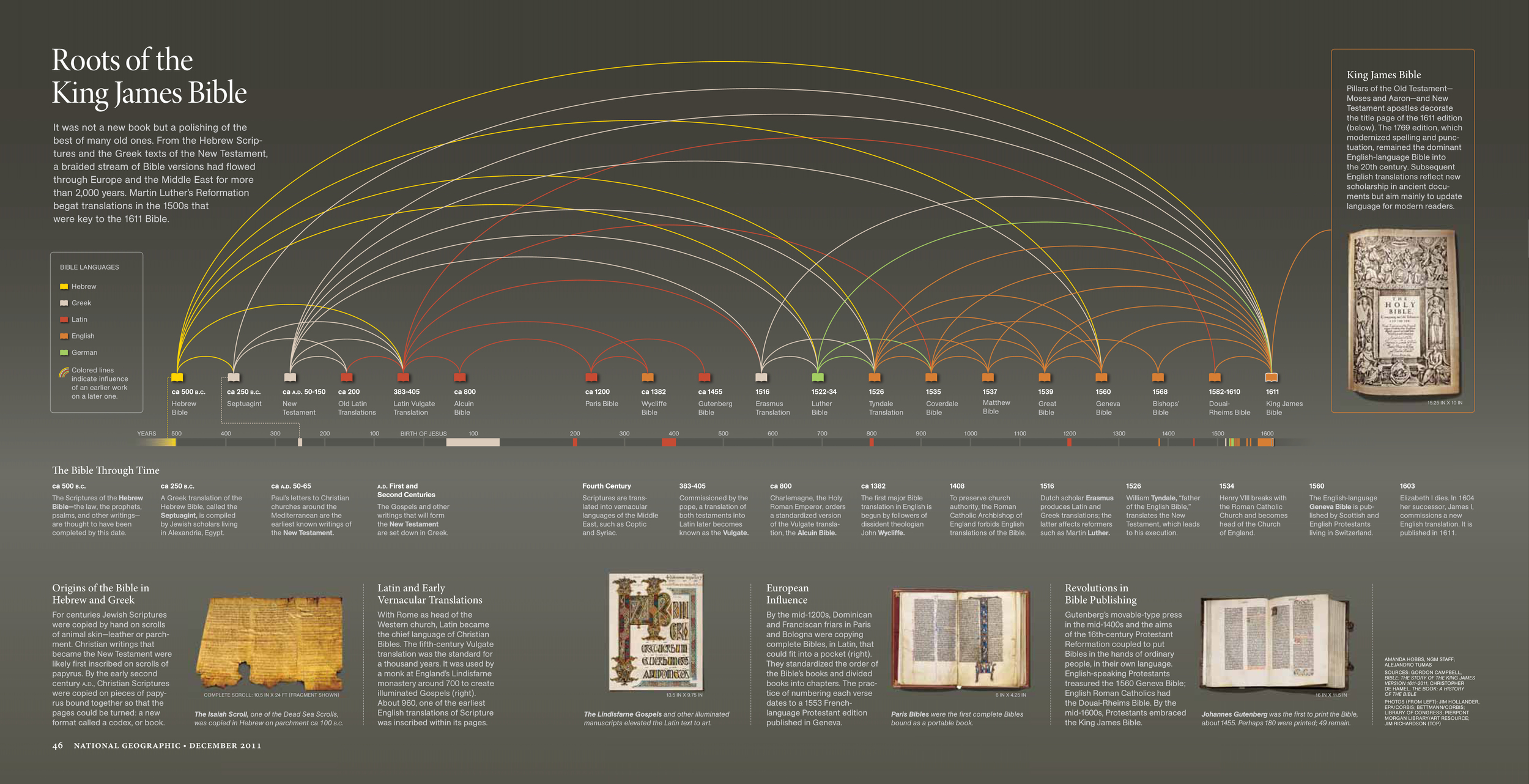
In the case of “Blue Holes of the Bahamas,” it was decided very early on that the main part of the graphic would be a reconstruction of the cave. So, even though it took tremendous effort to explain how the cave formed and why it was so interesting to scientists, we at least had some sort of an idea of what our main focus would be. For many stories, however, there isn’t such a clear-cut path to follow. For example, take the King James Bible story that appeared in the December 2011 issue of National Geographic. We knew we wanted to do some sort of graphic that addressed the history of biblical translations leading up to the KJB, but we weren’t sure exactly what this meant, what it should look like, or if it would be interesting to readers. As I began researching, I also began drawing, making connections, and searching for patterns. The diagram below is what emerged: the most important biblical translations (edited for space and clarity) arranged in chronological order and connected by lines of influence, color-coded by the language of translation.

Sketch: Amanda Hobbs

Sketch: Amanda Hobbs

While it may seem logical to assume one translation would begat the next, the real story was that more often than not, the influence of an earlier translation on a later one didn’t proceed in a straight line, but jumped around, and often in surprising ways.

Having something visual to show the designer enabled us to talk in more concrete terms about what something like this could (and should) look like, and it helped us to outline our thoughts and begin the process of organizing the entire magazine spread. Below is the end product. Though different from the original sketch, you can see the continuity. Having a firm plan from the beginning – based in solid research – helped us to save time in creating the final version. We knew it would work, we just had to get the presentation right.

National Geographic magazine, December 2011. Reproduced with permission. Amanda Hobbs, NGM staff; Alejandro Tumas.

National Geographic magazine, December 2011. Reproduced with permission. Amanda Hobbs, NGM staff; Alejandro Tumas.

While we’re speaking of timelines (and history not flowing in a simple, linear fashion), here’s another example from a freelance project I worked on in 2013. It’s a timeline of the history of exploration, which not only shows the adventurous side of human nature, but also how discoveries in one area of exploration can and often do affect others.

National Geographic magazine, June 2013. Reproduced with permission. Matthew Twombly and Jane Vessels, NGM Staff; Amanda Hobbs.

National Geographic magazine, June 2013. Reproduced with permission. Matthew Twombly and Jane Vessels, NGM Staff; Amanda Hobbs.

I like this exploration timeline because it illustrates an important point regarding the research and editing of a graphic. World history is a HUGE topic, even after you look at it just in terms of exploration. Indeed, what does “exploration” mean? To research something means you must first define it, and it turns out that lots of different people define exploration in lots of different ways. Fortunately for me, I was working with two amazing colleagues on this project, Jane Vessels (Text Editor) and Matthew Twombly (Graphics Specialist). In the end, we decided to focus on not only physical exploration (going to a place you’ve never been before), but also the different reasons for exploration (trade, conquest, spiritual quest) and the tools that helped make it possible (maps, navigational equipment, advancements in transportation). Coming to this decision, however, took several months of research and dozens of rounds of edits. Below are three such rounds – apologies in advance for my copious use of colored ink and highlighters (I do so love a good marker). 

EXtimeline1.jpg
EXtimeline2.jpg
EXtimeline3.jpg

Not all graphics can be timelines (thank goodness!), but many do involve the element of time, and more specifically, change over time. The graphic spread below was part of a story dealing with current levels of sugar consumption in the United States and how it has changed from the beginning of the 20th century to today.

National Geographic magazine, August 2013. Reproduced with permission. Photo illustration: Robert Clark; Lawson Parker, NGM staff; Amanda Hobbs; Alejandro Tumas

National Geographic magazine, August 2013. Reproduced with permission. Photo illustration: Robert Clark; Lawson Parker, NGM staff; Amanda Hobbs; Alejandro Tumas

Sounds pretty straight forward, right? Well, it turns out this can be harder to measure than you might think. First, are you talking about naturally occurring sugar in foods like fruit, the kind you keep in a sugar bowl, or the high fructose corn syrup found in most processed foods? Oh, and what about the sugar that we don’t really think of as sugar, but after you eat it your body converts it into sugar? Researching this story was truly an education in itself (with the immediate outcome being that I now eat less sugar, and you should too - the statistics are terrifying).

Putting together a graphic like this meant sifting through mounds and mounds of data and statistics. Because of course, when you’re starting from scratch, the data is the best place to find inspiration.

SUGARexcel1.png

And, once I had a look, I started compiling it in different ways to flush out the most compelling stories. For this graphic, we especially wanted to show how easy it was for people in the United States to consume the daily average of 22.7 teaspoons of “added sugar” (i.e. not the kind you find in fruit, but the stuff in your sugar bowl and in the processed foods that you eat).

SUGARexcel2.png

What we ended up with was both startling and surprisingly simple to illustrate (although getting the look just right required incredible diligence on the part of the Graphic Editor, Lawson Parker, and the Photo Editor, Susan Welchman). Turns out, it doesn’t take much to equal those 22.7 teaspoons of sugar. For example, the following combination is what we highlighted in our graphic:

  • 1 cup of Lucky Charms cereal
  • 4 slices of bologna
  • 2 slices of wheat bread
  • 3 tablespoons of ketchup
  • 3 Oreo cookies
  • 1 8 ounce container of fruit yogurt
  • 1 12 ounce can of cola

Crazy. Though, I must say that in many ways I’m surprised that the average isn’t higher . . .

At the opposite end of the graphics spectrum is one of my favorite things to work on – historical illustration. As a historian, I find it particularly fulfilling to work on projects where I get to be a part of bringing a specific time and place back to life. Whether they are scenes of historical significance or archaeological reconstructions (or both!), these pieces are a true combination of sound research and artistic beauty.

Take the example below. Created for a story on the Incas, it depicts a ceremony where the mummified remains of previous rulers were brought into the main plaza of Cusco:

National Geographic magazine, April 2011. Reproduced with permission. Art: Jon Foster, Jeff Osborn; Amanda Hobbs, NGM Staff.

Some might look at this piece and think that it’s just an "artist’s interpretation." Though the artist played a huge role in the creation of the artwork, the whole story was something much larger. Before we could even get started on the mummy scene, I traveled to Peru to visit the historical sites of Cusco and Machu Picchu and speak with archaeologists studying Inca artifacts, architecture, and culture. From the clothing and headdresses to the exact texture of the mummified skin, all aspects of the scene were copiously researched and discussed at length with archaeologists, art historians, and textile experts. The image below shows four examples of the visual references on which the artist based his illustration:

Incas MM7808_013-21 copy.jpg

Yet, creating a scene isn’t just about representing material objects, but about human interaction. Beyond collecting images of artifacts and clothing, you have to determine where the scene should be located, who should be in it, what sort of action should be shown, when it occurred (year, time of day, season), why it’s important, and how it might have happened. This meant doing additional research into all aspects of Inca religion and social structure to understand what roles the individuals in the scene would have played and how they would have interacted with each other.  After all, you can’t just call the artist and say “Can you draw some sort of ceremony with mummies in it?”

When the historical record didn’t provide enough clues as to exactly what something might have looked like, or how something in the ceremony would have transpired, we asked experts to give us their best guess. This is often a fun, but arduous process, and one that can result in multiple revisions. The artist for the Incas piece, Jon Foster, was a model of patience with us. Below is a succession of images highlighting the numerous changes we asked him to make in order to get one particular part of the illustration “just right.”

Art: Jon Foster

Art: Jon Foster

Of course, sometimes the pursuit of accuracy has less to do with research or getting the experts to make their best guess, and more to do with overcoming unforeseen obstacles.  I usually pride myself on thinking two steps ahead (credit here goes to my father for teaching me to play chess at the age of four), but even I could not have predicted the government shutdown in the fall of 2013.  At the time, I was working on researching a graphic for Scientific American on the appearance and spread of Cryptococcus gattii, a nasty fungal infection that started showing up in the Pacific Northwest in the late 1990s. I was able to contact the CDC only once before it, and many other government agencies, were closed due to the shutdown. Solution? Contact each individual state health department and create my own shorthand database so we could continue refining the graphics (and pray the CDC would open again before the article went to press). To stay up to standard, and on deadline, you have to be willing to go the extra mile.

And there you have it – a little insight into what I do and how I do it. I guess you could say that I’m an editorial “jack-of-all-trades,” but I think when you get right down to it . . . I’m just a problem solver at heart.

My answer to the question: “So, what do you do?” (Part 1)

Over the last few months, I’ve noticed that I often have to explain what I do for a living. Though most people have a general idea what freelancing is, they don’t understand what information graphics are, or furthermore, why someone would need a freelance researcher/editor to help make them.  I finally decided that if friends and family are this interested (and confused) then perhaps it was time I addressed this question in a blog post.

First, let’s start with the basics. When I say that I do freelance editorial work for graphics, I mean that I work with the visual display of information, often referred to as data visualization and information graphics (or as Nigel Holmes prefers to say “explanation graphics”). These graphics and visualizations can take many forms: charts, graphs, maps, illustrations, 3D models, etc. They can be print or digital, interactive or static, incorporated into an article or stand alone, and consist of one element or many. But of course, as Alberto Cairo points out in his book The Functional Art, “graphics, charts, and maps aren’t just tools to be seen, but to be read and scrutinized . . . aesthetics do matter, but aesthetics without a solid backbone made of good content is just artifice.”

So, where do I fit into this? Well, I work with the content. Though it differs from client to client, the services I provide include: figuring out what the most interesting content might be, doing in-depth research, coming up with suggestions for visual presentation, working with a designer to turn them into reality, editing the visual elements for accuracy, and writing/refining the words that accompany the graphics. As this can be a mouthful, sometimes I find it better simply to say: I help others to work more quickly and efficiently, so that the best possible visual content can be created. In essence, I am that person that helps everyone else achieve their full potential. Ever heard someone say that they could have done it better if only they’d had more time, resources, and information? Well, that’s what I provide.

Now, you might be saying “Wow, that’s cool, but isn’t that a pretty niche market?” And you would be right. Except that information graphics, data visualization, interactive media, and the like, are practically taking over journalism – especially online. Heard of “Big Data?” Unless you’ve been living under a rock, with no Internet connection, and only a lizard for a friend . . . I’m pretty sure you have. Well, today there is more data and information accessible to journalists than ever before, and this data can be used to make lots of things easier to understand; to show us patterns that, until now, we didn’t even know existed. Nathan Yau, author of Data Points and creator of FlowingData.com, describes the best visualization as something that “evokes that moment of bliss when seeing something for the first time, knowing that what you see has been right in front of you, just slightly hidden.” As you can imagine, it’s not just the news media that are interested in harnessing the power of data viz and information graphics, but also magazines, marketing firms, blogs, non-profits, financial institutions, museums, and many others.  

During my career I’ve had the pleasure to work with several such organizations, many of which have been surprised by my background (I have a BA and an MA in History). Though they may wonder how I ended up working in visual journalism, to me it always seemed like a natural extension of my professional and academic training. Indeed, working in an art museum and taking graduate courses in museum studies and historic preservation has, perhaps, informed the way I look at graphics more than anything else. To design an exhibit you must ask many of the same questions that you would while designing information graphics. Who is my audience, what is my narrative, how do I want people to interact with my content, what do I want them to come away with, and what sort of design will help me achieve all of this? Over the years I’ve fulfilled various different professional roles, but all had certain key elements in common: research, writing, art, and communicating with the public. And all have benefitted from my training as an historian.

In the end, because no proper examination of what I do would be complete without visuals,  “Part 2” will focus on the research/editing process and provide some examples from projects I’ve worked on over the past few years. Why break it up into two parts, you ask? Well, after working on this post off and on for a few weeks (and inevitably being distracted by more pressing deadlines), I finally decided to upload it in two parts. Pulling together examples from past projects requires a walk down memory lane – a very pleasant, but nonetheless time consuming process. And, I’d rather stroll than sprint . . .

Reflections on Freelancing, Year One . . .

Since starting my own business in October 2012, I’ve had one heck of a ride. It’s been a year of hard work, late nights, new accomplishments, amazing opportunities, and the discovery that going freelance was the best decision I could have made at this point in my career.

At once rewarding and invigorating, “going it alone” can also be completely terrifying. I’ve been very lucky that the decision to leave my full time job at National Geographic didn’t mean I’d have to cut ties with my former colleagues. As I see it, I now have the best of both worlds. I continue to freelance with folks at NGM whom I admire and respect, but also have the ability to take on new and different work for other clients as well – The New York Times Idea Lab and Scientific American, to name a few. Doing so has given me a broader sense of how my skills and abilities can be applied to a variety of editorial and project management roles. If I was used to thinking of myself as a jack-of-all-trades, now I know I am.

You see, when you work for yourself, you have to be your biggest fan, your worst nightmare, and everything in-between. Sometimes you have to push yourself to meet a deadline, and others convince yourself it’s time to take some R&R.  You have to be creative but pragmatic, resourceful yet realistic. And of course, you have to be willing to take risks. Sometimes these will pay off (literally), and sometimes they won’t. But if you learn more from your mistakes than your successes, then no matter the result, you still come out ahead.

Indeed, I’ve made plenty of mistakes along the way, but taking a wrong turn here and there is a matter of course for freelancers – not something to avoid, but something to be embraced and learned from. After a year of full-time freelancing, I have learned more about myself, my craft, and my potential than ever before. But perhaps the most important thing I’ve learned is this: you have to believe in yourself. If you don’t, no one else will either.

Now that 2013 is drawing to a close, I'd like to say thank you to everyone I’ve worked with, and learned from, over the past twelve months. My freelance journey is just beginning, and I’m grateful for every step along the way . . .


Space: The ever-changing frontier . . .

The June 2013 issue of National Geographic​ magazine (out now!) includes a graphic titled "Cosmic Journeys," an earlier version of which ran in an NGM special issue in 2009. This spring, I helped revise and update the content so it could be included in a yearlong series on exploration in honor of the Society's 125th anniversary. Doing so made me realize not only how far we've come, but also how much further we still have to go in exploring our universe. Will we one day live aboard star ships, boldly going where no man (or woman) has gone before? I certainly hope so . . .

National Geographic magazine, June 2013. Reproduced with permission.Art by Sean McNaughton, Samuel Velasco, 5W Infographics. Matthew Twombly and Jane Vessels, NGM Staff; Amanda Hobbs​

National Geographic magazine, June 2013. Reproduced with permission.

Art by Sean McNaughton, Samuel Velasco, 5W Infographics. Matthew Twombly and Jane Vessels, NGM Staff; Amanda Hobbs

Malofiej 21, an afterword . . .


This year I attended the 21st installment of Malofiej as a jury member and speaker. Others in attendance have already posted recaps (see Jen Christiansen’s “Behind the curtain at Malofiej” or Al Shaw’s “Between Human and Machine: Thoughts on Malofiej . . . “) so I'll refrain from a full summation of events here. Suffice it to say, it was one of the most amazing and thought provoking experiences of my life.

To my fellow jury members - I owe you a debt of gratitude. It was an honor and a pleasure sharing a week with you discussing the work of incredibly talented people from all over the world. And here I use the word "discussing" deliberately. Though we were charged with judging information graphics and handing out medals, the four days of viewing more than a thousand entries never felt . . . judgmental. Insightful comments, careful deliberation, and thoughtful debates abounded. Sure, some decisions were easier than others, but there was always an appreciation and understanding of the effort that went in to each graphic, chart, map, illustration, etc. I will always be grateful for the opportunity to meet, and learn from, each of you.

To all those who submitted entries – what an inspiration! The depth and breadth of topics covered was incredible. From local interest pieces to global news stories, we saw graphics focusing on science, pop culture, breaking news, history, the environment, politics – anything you can think of that would benefit from a visual display of information. When content and design meshed seamlessly, we moved it into medal contention. And when we couldn’t think of a way to improve it, we gave it a gold.  In the end, everyone receiving an award – whether it be gold, silver, or bronze – should be congratulated for a job well done.

See the complete list of all the winners of Malofiej 21 here.  

View a short, behind the scenes, video of Malofiej 21 here.


Malofiej 21

This March I'll be attending Malofiej 21 as a jury member and speaker. Looking forward to spending a week learning from (and geeking-out with) some of the most interesting, talented, and inspiring folks around. No pressure . . .